You are currently browsing the tag archive for the ‘Color’ tag.
by Deb Shaw
A New Blue

Blue pigment discovered at Professor Subramanian’s lab at Oregon Stste University. Photo from Oregon State University.
Professor Mas Subramanian is a professor of materials science at Oregon State University, researching new materials that could be used in electronics. In 2009, one of his grad students, Andrew E. Smith took a mixture out of the furnace that had been heated to more than 2,000 Fahrenheit and found it had turned a brilliant, clear blue color. They had accidentally, serendipitously discovered a new blue pigment; the first new blue in more than 200 years. The last “new inorganic blue” to be manufactured was Cobalt Blue in the early 1800’s. Cobalt, however, was not lightfast and was toxic to boot.
Considered a “complex inorganic pigment,” the new blue is currently called YInMn blue, named for its chemical makeup of yttrium, indium and manganese oxides.
Subramanian, Smith and Oregon State University chemistry professor Arthur Sleight patented the YInMn material; Shepherd Color, an industrial pigment distributor is testing out the pigment’s application. Once the Environmental Protection Agency approves the color for commercial manufacturing, Shepherd is licensed to sell the pigment. So far, YInMn has proven to reflect heat more than Cobalt Blue and has proven to be remarkably stable; holding up against oil, water and sunlight better than other available blues. In addition to being light safe, none of the ingredients are toxic.
Once large manufacturers are using a pigment, the material trickles down to our art supplies. Keep your eyes open in the next few years for a brand new blue, which will most likely receive a sexier name for marketing purposes. And the team of “new blue” researchers are already working to create new colors by altering the mixture. They have created a purple by adding titanium and zinc and are expecting additional bright, vivid colors to follow.
National Public Radio (NPR) has an article online with interesting links about the new blue from July 16, 2016. Oregon State University has an in depth article about it as well.
Late Summer “Reads”: Links to Books and Online Articles and Podcasts about Color
Now that we’re hitting the dog days of summer, here are some interesting books, links and podcasts about color:
NPR has a series of free podcasts about color, called Color Decoded: Stories that Span the Spectrum. Read the articles, or listen or download them all from the link, or individually from any of the links below. Many of the following (in reverse order) are only a few minutes long, so queue them all up. Some of them have been featured on our BAGSC News blog previously. They’re fun listening while painting or drawing:
- For One Artist, Colorblindness Opened Up A World Of Black And White
- The Color Of Politics: How Did Red And Blue States Come To Be?
- How Kodak’s Shirley Cards Set Photography’s Skin-Tone Standard
- Sacred, Sad And Salacious: With Many Meanings, What Is True Blue?
- How Animals Hacked The Rainbow And Got Stumped On Blue
- These X’s Are The Same Shade, So What Does That Say About Color?
- Is It Time To Reappropriate Pink?
- Whether Green With Envy Or Tickled Pink, We Live In A Color-Coded World
- #ColorFacts: A Weird Little Lesson, In Rainbow Order
- Girls Are Taught To ‘Think Pink,’ But That Wasn’t Always So
- The Golden Gate Bridge’s Accidental Color
- Celebrating Green: As Color, As Concept, As Cause
- The Color Red: A History in Textiles
Each of the individual articles have links to other resources and stories about color: TED Talks, podcasts and news articles. It’s easy to journey deep into online color discoveries.
For those who prefer spending the end of summer curled up with a good book, here are a very few great reads about colors:
- A Perfect Red: Empire, Espionage, and the Quest for the Color of Desire, Amy Butler Greenfield, ISBN-10: 0060522763
- A Red Like No Other: How Cochineal Colored the World, Carmella Padilla and Barbara Anderson, ISBN-10: 0847846431
- Mauve: How One Man Invented a Color That Changed the World, Simon Garfield, ISBN-10: 0393323137
- Color: A Natural History of the Palette, Victoria Finlay, ISBN-10: 0812971426
- The Brilliant History of Color in Art, Victoria Finlay, ISBN-10: 1606064290
- Rarest Blue: The Remarkable Story of an Ancient Color Lost to History and Rediscovered, Baruch Sterman, ISBN-10: 0762782226
Have a favorite book about the history of a color? Let us know in the “Comments” section.
Enjoy!
![Mummy Brown* and Other Historical Colors, Arranged by Date (More or Less) from Prehistory to Almost-Present, Veritable Hokum, by Korwin Briggs, http://www.veritablehokum.com/ [Click image for larger view.] Used with permission as stated in terms under "About", © 2015.](https://bagscblog.com/wp-content/uploads/2015/09/pigments.jpg?w=304&h=1024)
Mummy Brown* and Other Historical Colors, Arranged by Date (More or Less) from Prehistory to Almost-Present, Veritable Hokum, by Korwin Briggs, http://www.veritablehokum.com/ [Click image for larger view.] Used with permission as stated in terms under “About”, in the Veritable Hokum blog. © 2015.
Korwin Briggs is an illustrator who publishes the online comic blog Veritable Hokum (click the name to go to the blog). As he writes in his “About” section, “Veritable Hokum is a comic about mostly history, maybe science, and possibly some other stuff too.”
This week’s delightful post is a comic illustration and description about the history of pigments, entitled “Mummy Brown* and Other Historical Colors, Arranged by Date (More or Less) from Prehistory to Almost-Present.” Click on the link above to read the entire article as well as enjoy the graphic description of some of our favorite pigments. The history doesn’t go all the way to the modern Quinacridones, but contains fun facts and history in a quick read format with a great sense of humor.
Enjoy!
by Deb Shaw

NPR’s “Look at This”
NPR posted a charming “Look at This” on October 23, 2014. Titled “This is Color: A Weird Little Lesson, in Rainbow Order,” by Nicole Cohen and Beth Novey, the presentation takes the viewer through the rainbow with facts, trivia and interesting information about color. Well worth taking a break for a few minutes.
by Deb Shaw

Eight crayons; photo from DataPointed: http://www.datapointed.net/2010/01/crayola-crayon-color-chart/
Many of us began our first forays into art and color with a box of crayons at a young age. Crayola Crayons, according to their website, began in 1885, when two cousins, Edwin Binney and C. Harold Smith took over Edwin’s father’s pigment business. At the time, they used pigments such as red oxide (used as barn paint), and carbon black (used in car tires). In 1903, Crayola produced the first box of eight wax-based crayons, at 5 cents each box. Those original colors included: red, orange, yellow, green, blue, violet, brown, and black. The original limited palette.
Flash forward to 2010 (when the graphics in this post were created) and you’ll find 120 colors in the Crayola color box! New colors come with new and interesting names, such as: “Cerise” (a dark, cool, violet-red), “Outer Space,” “Inchworm,” and “Atomic Tangerine.” We can be completely sympathetic; as botanical artists, we, too, face the marketing of an expanding universe of new professional colors with new names each year.
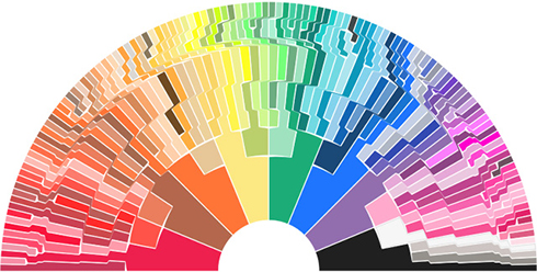
Stephen Von Worley’s graphic showing the expansion of Crayola colors from the original eight crayons. To view an interactive graphic, where rolling your mouse over a color displays the color’s name, go to: http://www.datapointed.net/visualizations/color/crayola-crayon-chart-bow/
On his website, Data Pointed, artist, scientist and data visualization researcher Stephen Von Worley gives credit to a pseudonymous friend with whom he works, called “Velociraptor.” Together, they created a series of data graphics showing a visual crayon chronology in two articles: “Color Me A Dinosaur: The History Of Crayola Crayons, Charted” and “Somewhere Over The Crayon-Bow: A Cheerier Crayola Color Chronology.”
Data Pointed explores the best methodologies for conveying information and data visually. Interesting to me was the evolution of his crayon color graphic. The original article “Color Me A Dinosaur” displayed the crayon chronology in a square format. The story was picked up quickly over the web, and has recently seen renewed interest. Stephen was interested in the audience reaction to the square, and, in his second article on the subject, “Somewhere Over the Crayon-Bow,” he re-visits his graphic, working on portraying the same information in different visual formats to see the effects.
by Deb Shaw

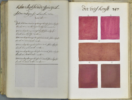
A. Boogert manuscript image, reposted from http://www.thisiscolossal.com. High resolution, zoomable image can be viewed on e-corpus.org from link in this article.
On April 30, 2014, Medieval scholar Erik Kwakkel posted about a book from 1692 he had come across in a French database about mixing colors in watercolor. Known only as A. Boogert, the artist/author hand-wrote and hand-painted a comprehensive guide in Dutch of more than 700 pages, describing how to make watercolor paints, how to mix colors, and how to change the tone by adding “one, two or three portions of water.”
Titled Klaer lightende Spiegel der Verfkonst, or Traité des couleurs servant à la peinture à l’eau, the manuscript is a visual feast of color and calligraphy. Luckily, every page is available to view online in high resolution, zoomable images on e-corpus.org. The original volume resides in the archives of the Bibliothèque Méjanes in Aix-en-Provence, France. The bibliography for the book contains references to the Dutch East India Company, European textile export to India, and Indian textile export to Europe. Erik Kwakkel has translated part of the introduction; the book was intended to be an education guide to color.
Erik’s original blog post was quickly reposted by Colossal, Gizmodo, and greg.org, and from there has quickly spread across the web. If you read Dutch and find anything interesting while looking through the volume, feel free to comment on any of the blog sites.
In the meantime, enjoy!
 A. Boogert manuscript image, reposted from http://erikkwakkel.tumblr.com/. High resolution, zoomable image can be viewed on e-corpus.org from link in this article.
by Deb Shaw
If you’re a fan of RadioLab, you may have heard the last episode about “Colors.” If you haven’t heard it, you’re in for a treat. You can listen, stream, or download the RadioLab Episode on “Colors” (Episode 13) by clicking here.
The piece jumps into all kinds of subjects about color, including interview snippets with Victoria Finlay, who wrote the book by the name of Color. From Issac Newton and Homer; to how we see (as opposed to dogs, birds, butterflies, and mantis shrimp); to our language about color; to how Gamboge is made — it’s a great show with a fun soundtrack.
If you haven’t listened to RadioLab before, be sure to stick with it. Their station identification pieces are a little longer than most, and I do know people who have thought the program was over, when it was really just getting started.
Enjoy!
by Deb Shaw

Color test chart by X-Rite
The X-Rite site has a new, nifty Hue Test they’ve developed. They report that 1 out of 255 women and 1 out of 12 men have some form of color vision deficiency. Their online color challenge, based on the official FM100 Hue Test is a fun way to see how well you see hue and value across the spectrum. Rearrange the squares in order of hue and then click on the “score test” button to see how well you do! Zero is a perfect score.
